Overview
The entire world is composed of geometry, especially in art and design. Understanding how this geometry works in the context of graphic design is incredibly important, especially when trying to understand the principles of design.
This understanding in combination with other principles and theories are together known as Visual Grammar, the cumulative understanding of how a work of art is composed. Visual Grammar is important because it is not just the exploration of one principle or element of art, such as balance, color, or symmetry, but rather how all of these aspects engage and respond to one another.
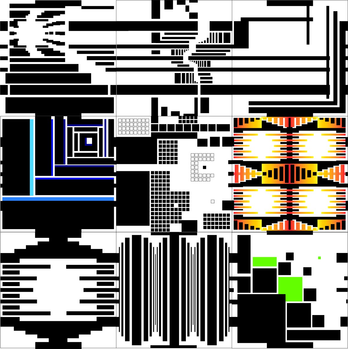
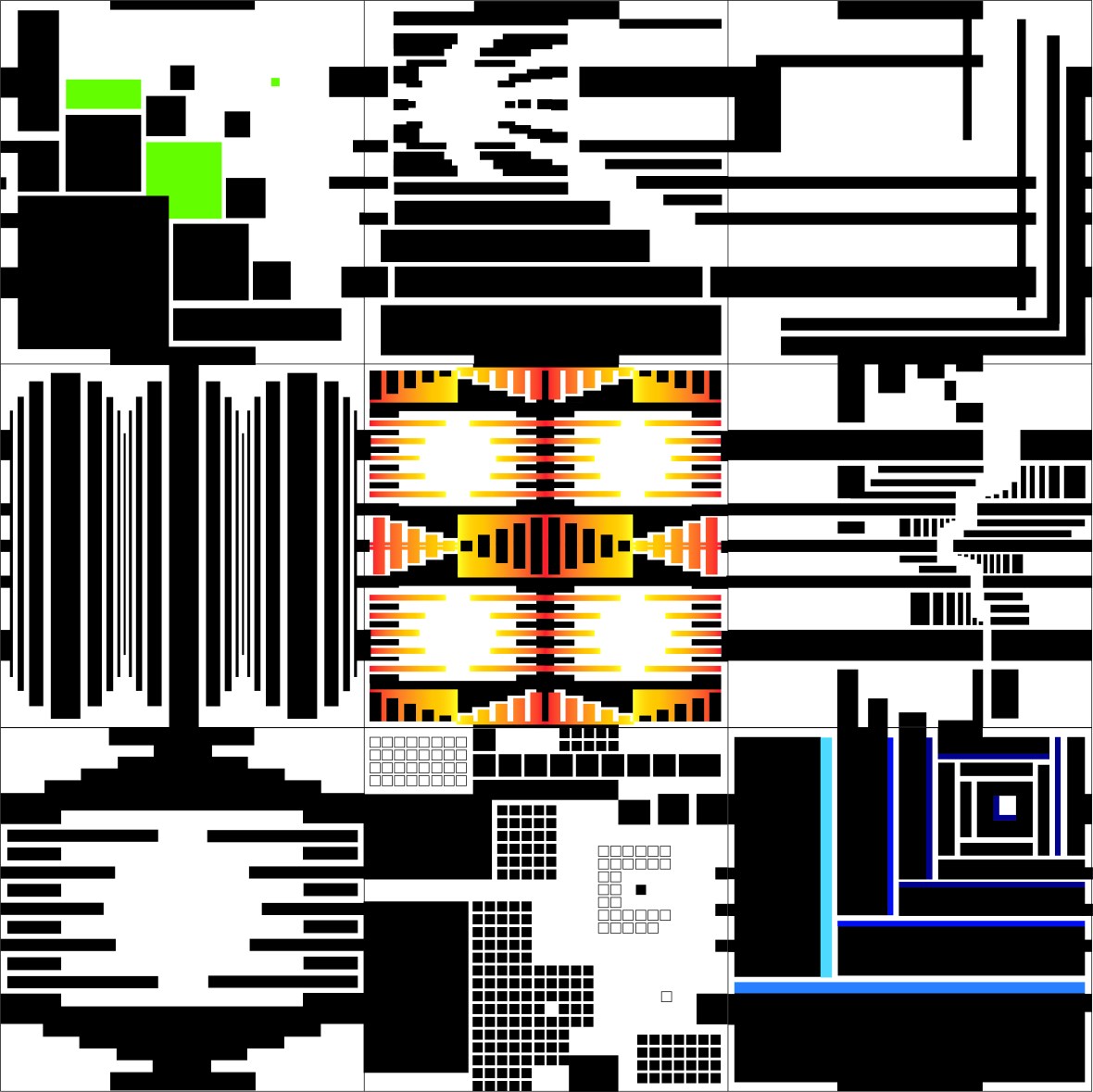
In class, we worked on compositions dealing with nine different categories: symmetry, isolation, spatial depth, asymmetry, motion, rhythm, perspective, patter, and fragmentation. The catch? The lines were only allowed to be horizontal or vertical, and each set of three principles had their own specifications.
I enjoyed the hands-on quality of this workshop and the problem-solving required for this task. In the end, and through my personal exploration afterwards, I feel I learned a lot about three key aspects of visual grammar: geometry, layout, and space.
Research and Study
For further research and study, I chose to look into the work of five additional artists: Piet Mondrian, Noma Bar, Friedensreich Hundertwasser, GUE, and Marina Tabassum.
- Piet Mondrian: Dutch artist of the DeStijl and Neo-Plasticism movement, most famous for simple use of rigid lines and minimal colour.
https://www.tate.org.uk/art/artists/piet-mondrian-1651
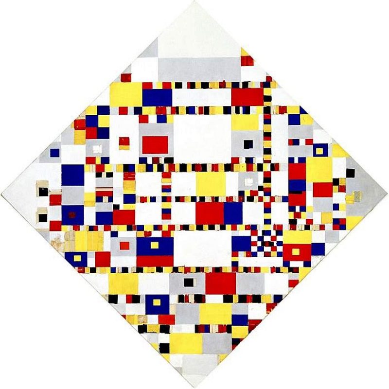
Piet Mondrian Victory Boogie Woogie : https://www.piet-mondrian.org/victory-boogie-woogie.jsp
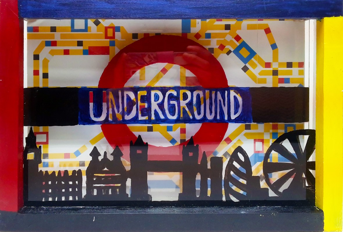
Personal art of London Underground inspired by Mondrian.
- Noma Bar: modern Israeli designer focusing on figure ground and graphics.
https://www.dutchuncle.co.uk/noma-bar/

medium.com/winning-mark/that-header-graphic-by-noma-bar-is-nice-work-21f93992f79

https://www.itsnicethat.com/here-london/noma-bar-from-there-to-here-250517
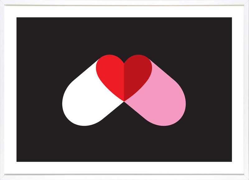
https://theartstack.com/artist/noma-bar-1/love-drug-1
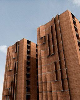
- Friedensreich Hundertwasser: Austrian-born New Zealand Artist who uses curved lines and irregular colored forms
https://en.wikipedia.org/wiki/Friedensreich_Hundertwasser
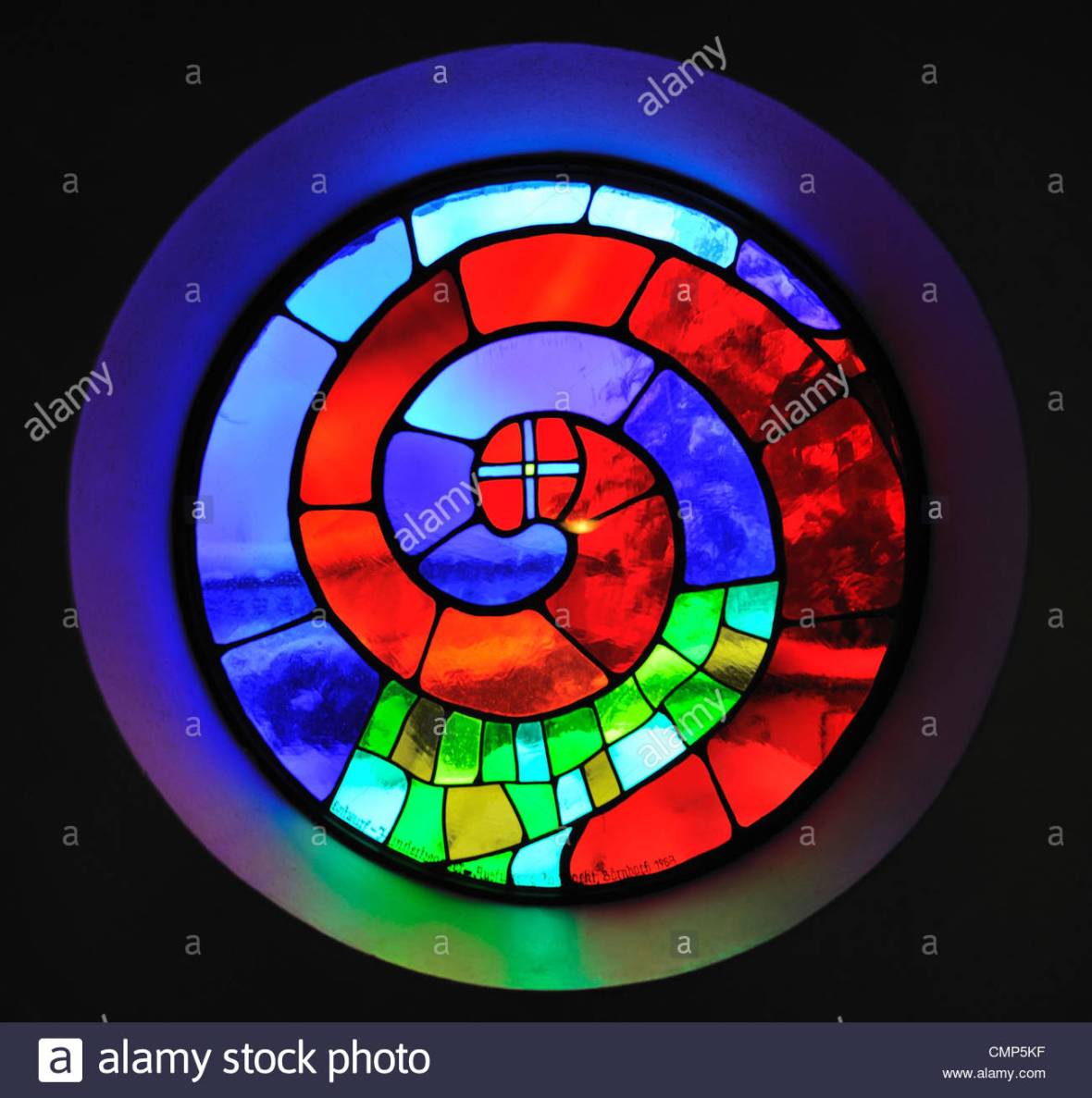
https://www.alamy.com/stock-photo/church-window–barnbach.html
- GUE: Italian street artist
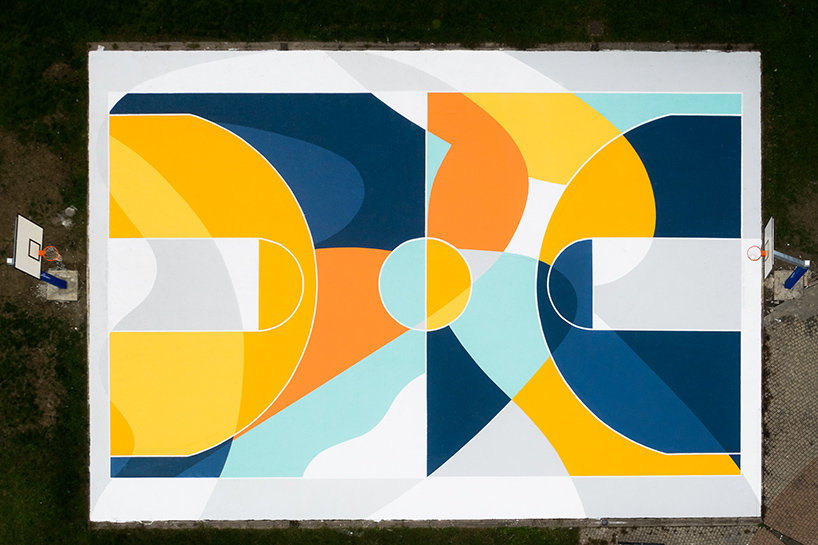
https://www.designboom.com/art/gue-basketball-court-painting-alessandria-italy-01-27-2017/
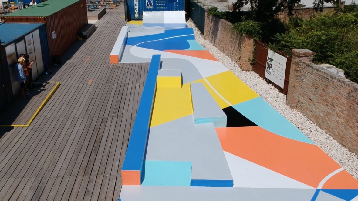
https://lumieresdelaville.net/un-nouveau-skatepark-transforme-par-lartiste-gummy-gue/
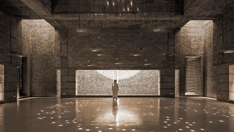
- Marina Tabassum: Bangladesh artist who runs her own practice (MTA), which focuses on, “community centre and public school to museum and eco-resort.”
https://www.barbican.org.uk/whats-on/2018/event/architecture-on-stage-marina-tabassum
https://www.barbican.org.uk/whats-on/2018/event/architecture-on-stage-marina-tabassum
https://alchetron.com/Marina-Tabassum
Conceptual Development and Experimentation
This experiment is based off of Mary Cassatt’s print The Coiffure, pictured in the top left hand corner. Based on what we learned in class, I felt that there were three core ideas behind visual grammar that were key to understanding the concept: geometry, layout, and space.
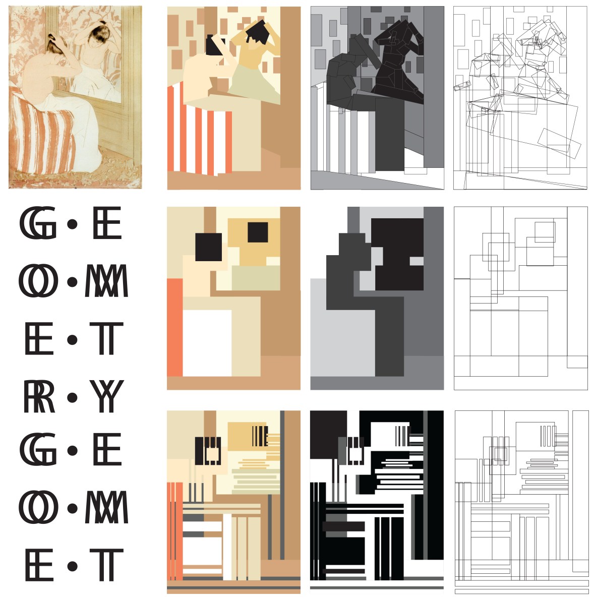
The first row of this exploration deals with the idea that everything is made up of geometric shapes, regardless of the complexity of the final output. I chose to represent this through block shapes at various angles, namely rectangles and squares. The progression moves from simple colors to block grayscale, and then finishes with a representation of just the shape’s outlines. The color version serves to show the piece in its closest form to the original, while still being entirely made of rectangles and squares, while the black and white version serves to block out the regions of depth, and the last version serves to show both the simplicity and complexity of using only squares and rectangles to build a very intricate work.
The second row of this exploration deals with layout in art, which can, in its simplest form, be translated to editorial design. By representing the colors, you can show the most basic composition of a piece, and even show where it should fall in the visual hierarchy and perspective, such as the block appearing framed in the square, which is the reflection in the mirror. The next stage more clearly showed where each block fell and how the layout of the piece works, further pushing the foreground-background effect. The final piece, while being outline-based and abstract, shows, again, that this piece is made of nothing but squares and rectangles.
The last row of this exploration explores depth and space, which can be achieved by something as simple as line weight or a series of vertical and horizontal rectangles. The goal of this row was to show this depth by manipulating those simple shapes to convey a clear foreground and background as in the original print.
The last touch on this piece is the type, which is a geometric sans serif typeface in the spirit of this exercise, copied and overlayed to create a “doubling” effect.
Another Layout Exercise
Geometric Mona Lisa, another layout exercise.
Movable Visuals: Finishing the Task and Exploration
My first exploration for this task first revolved around finishing the task we started in class, keeping to the restrictions to challenge myself into working with very minimal tools:
- For symmetry, spatial depth, and isolation, use ONLY horizontal lines
- For rhythm, motion, and asymmetry, use vertical AND horizontal lines
- For perspective, fragmentation, and pattern, use color, vertical, and horizontal lines

The next step in this process was to take it further. Personally, I love to work in 3D and interactive realms, and in learning more about this brief, I was immediately struck by how the different components of visual grammar work together, no matter how you configure them. So in this piece, I very much focused on the interconnectivity of visual grammar, creating a set of images which can be slid into any desired position and still work together, the mechanics of which are shown in the example below:
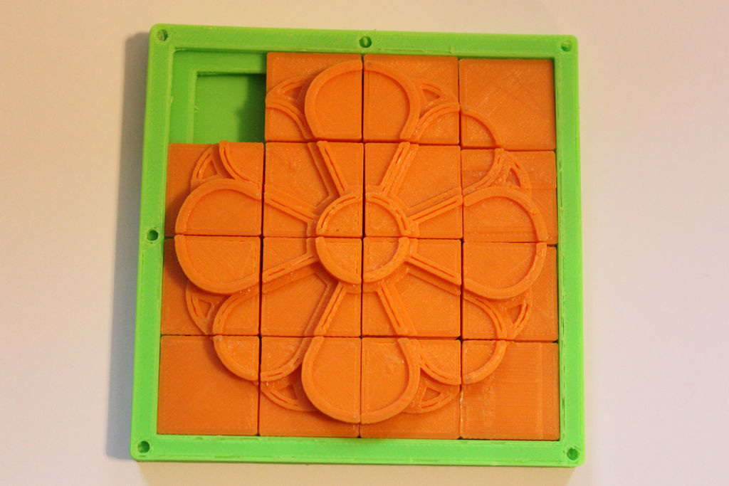
https://www.instructables.com/id/3-Dimensional-Sliding-Tile-Puzzle/
So, in conclusion, the end result is a composition of visual grammar which the viewer can arrange and rearrange to create increasingly new and different combinations of the exercise:
⇓⇓⇓⇓⇓⇓⇓⇓⇓⇓⇓⇓⇓⇓⇓⇓⇓⇓⇓⇓⇓⇓⇓⇓⇓⇓⇓⇓⇓⇓⇓⇓⇓⇓⇓⇓⇓⇓⇓⇓⇓⇓⇓