Overview
In the Principles session on the 30th of October, our class looked at typography and the various ways in which typographic design can institute hierarchy and organization. Typography is necessary for effective communication, and is very important to understand because it influences every part of our lives and design experiences, from magazines to apps to websites. The thing to note for me here is that good typographic design looks absolutely effortless – almost like it is not designed at all. The only time the typical consumer really notices typography in a massive way is when it does not work.
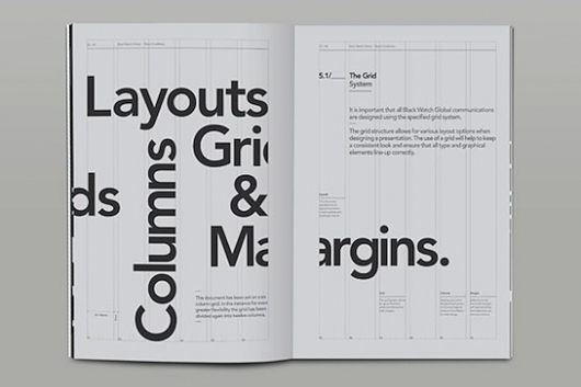
Important parts of this brief included the idea of the grid and the idea of testing many different types of designs. The grid, as the tutors explained, is incredibly important and vital for any kind of design work, especially in type and layout design.
In class, our three exercises revolved around placing type in dynamic and interesting ways in a very minimal way; for example, using one size and one of weight of type to create a composition. We then used these designs to develop our ideas further into a series of co-ordinated book covers.
Overall, I liked the exploration surrounding this project; while it was not really my area of interest, it was very interesting to experiment with a purely typographic design building meaning from type. However, I would have liked to know more about typography and its place on the grid beforehand. To be very honest, during the exercise, I would have rather started with the last exercise and gone to the first, so two sizes, two weights to one size, one weight, because it would have been a lot easier. Afterwards though, I started to understand that doing the work like we did was beneficial, because it really made my last three pieces much more complex spatially. I believe this is because I thought about the process more and had gained a greater understanding of what spatial typographic design means.
Research and Study
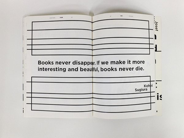
This is a different type of grid which allows for a very 3D manipulation of 2D typography. I personally enjoy this a lot
Neville Brody: UK designer who works with type


http://www.historygraphicdesign.com/the-age-of-information/postmodern-design/531-neville-brody (left) and flickr.com/photos/36925563@N02/4268365592 (right)
Wes Wilson and Carolyn Ferris: American artist of psychedelic posters and American artist who teaches younger children, designs, and works with Wilson


(Left to Right) (1) https://www.wolfgangs.com/posters/love/poster/BG040-1B.html (2) https://1960sdaysofrage.wordpress.com/2017/10/16/wes-wilson/ (3) https://moonaliceposters.com/summer-of-love-poster-by-wes-wilson-and-carolyn-ferris/
Website of the partners: https://www.wescarolynarts.com/


Arabic Typographic Design
https://www.freepik.com/free-vector/ramadan-mubarak-typographic-design_2187618.htm (left) https://www.smashingmagazine.com/2008/02/breathtaking-typographic-posters/ (right)
https://veritylee.wordpress.com/2015/03/16/typography-and-communication/
The Oh My Grid Project by Johnathan Foo (SO COOL)
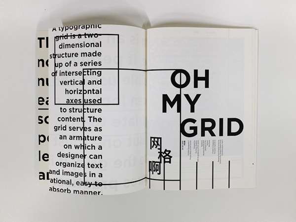
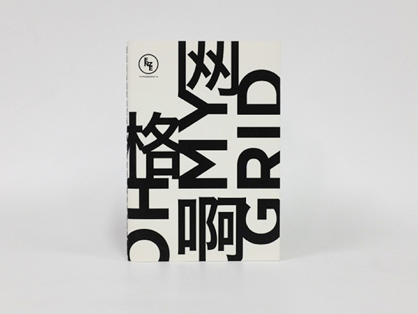
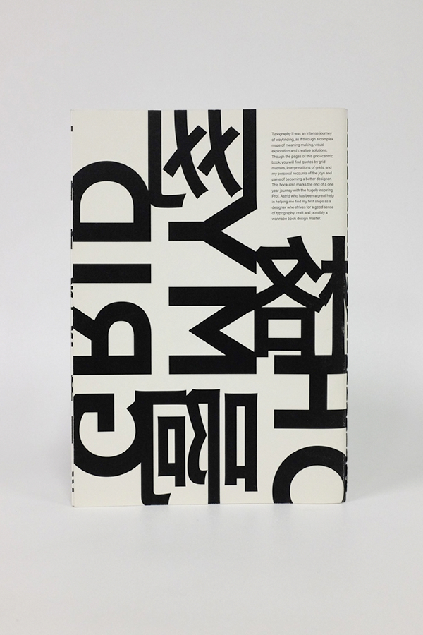
https://www.behance.net/gallery/10356467/Oh-My-Grid-Typography-II-Process-Book
THIS IS AN AMAZING WEBSITE: https://www.smashingmagazine.com/typography-guidelines-and-references/
Conceptual Development
In class, we were given a series of type in three different sizes and two different weights per size. We were then asked to design a book cover for a book about architecture using nothing but type in horizontal and vertical configurations and given three tasks with the following restrictions:
- Produce three finished layouts using only one size of type and one weight
- Produce three finished layouts using only one size of type and two weights
- Produce three finished layouts using two sizes of type and two weights


The first stage of designs with one size of type and one weight. The middle design could be much better with a different weight of type.


The second stage of the project with one size and two weights of type. The last design could be much better in a different weight, and I do like the second one in terms of experimentation, but I feel that it is difficult to read the important text when it looks so barcode-like. To correct this, the type might have to be switched in the future or shorter excerpts will have to be taken from the publisher line, i.e. only “Oxford” or “Design Press”.


This is the third stage of the exercise, with two sizes and two weights of type. The first is inspired by one in the second stage, and morphed into the final book cover, and the two latter are more experimental based on space and Gestalt. I did really like the second of the three, and the third experimental book cover came out in an interesting way, but for a final connected series, I felt that I could do more with the first one.
Completing the Task (Book Covers)
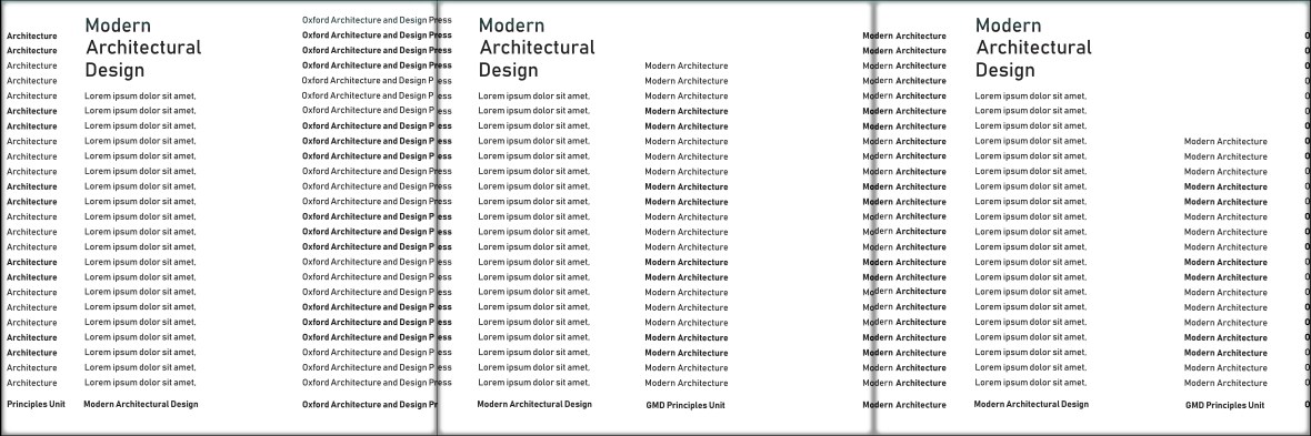
After the exercise above, we had the option to develop our chosen design further into a series of coordinated book covers, one for the Netherlands, one for France, and one for Germany.
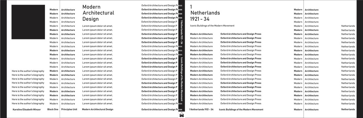
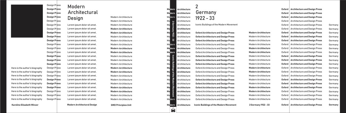
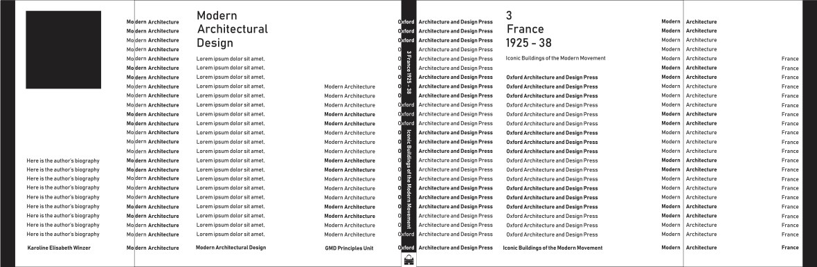
The dust jackets of all three books in order; these book covers use nothing but shapes, black and white colors, and typography of two sizes. The black box to the left of each design is a space for a black and white image of the author.
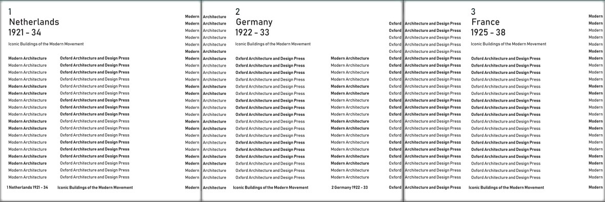
The fronts and backs (respectively) of the books, which form a skyline when placed in order.
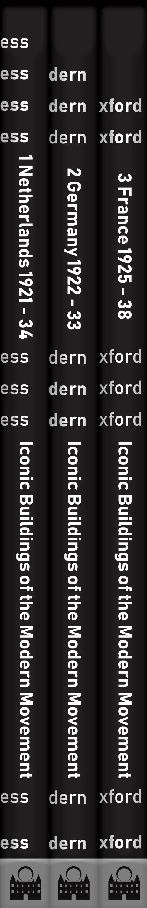
The spines of the book when lined up; this forms a kind of reminder of modern architecture, with a step-based progression of words at the top.
Reflection
I feel I could better execute these book covers by including the actual language of the nation which they represent, in addition to English. I feel that this would help make the design more worldly and also bring another facet to the work.
Extending the Task (Rune Covers)
(Coming Soon)
The idea behind my final task is to take type into the realm of language and symbolic communication. As I was doing this project, I was suddenly struck by the complexity and magic of language and reading in both the words and writings systems of each respective language.
For example, two languages that use roughly the same characters, save some accents, are Spanish and English. In English, if we see the word “song”, we clearly understand it as a short musical composition typically sung by one or more voices. However, if a non-Spanish speaker were to encounter the word “canción”, they may very well be able to pronounce the word (sounding it out, if you will), but they will not understand what that configuration of words means.
Now, take a language like Arabic or Chinese. These languages have an alphabet completely separate from the Latin symbols, and someone who knows nothing about them will not know what they mean or what they sound like.
So how do you get the point across when no one understands the writing? If the type is so strongly indicative of the meaning that it can convey the point and seem appealing without actually meaning anything to the reader, how can that change access and language barriers through visuals?
I plan to do this by creating a book cover of runes (a fairly non-understood symbolic system of writing from the Nordic regions similar to cuneiform from Sumeria and hieroglyphics from Egypt) and making it a visual representation of the book’s contents with color and form:
- Women of the North
- A book about the sacred feminine and female rulers (like the Druids and Boudicca)
- Men of the South
- A book about the Romans and how Christianity changed the sacred feminine
- Body of the East
- A book about the natural remedies and arts of nature closer to the sacred feminine and more common in the modern east
- Mind of the West
- A book about the mindset of the west and the modern re-emergence of the strong woman
This rune-themed dust jacket would then, when removed, have a book cover written in in English or German. Again, this still caters to someone who understands the language, but it shows you the meaning others may glean from the symbols of the cover; it might even simulate what it’s like to see something in your language and understand versus symbols you cannot begin to attribute reason to (this is an incredible facet of language for me; I just find it so cool that some people have learned to understand something from lines and symbols that I cannot see).
