Overview
Layout is essential to any kind of editorial design, and using a grid is, in turn, essential to layout. Grids can be either square or rectangular in their simplest forms, and are made up of rows and columns, as shown and described below.
To learn about the complexities of layout and hierarchy, we were given a set of restrictions in class and came up with four different layouts according to that set of four restrictions. We were also taught about different types of type and type styles, as listed below.
Overall, this has been my least favourite exercise so far, and I wish that we were more expressly told about how to effectively design a layout before starting the project, as I had to learn much of this myself after I had done what I thought was correct, only to find that I had done the exercise incorrectly. That being said, I did like the tactile quality of the in-class workshop, which was very different from the work I did at home, all digital.
Notes
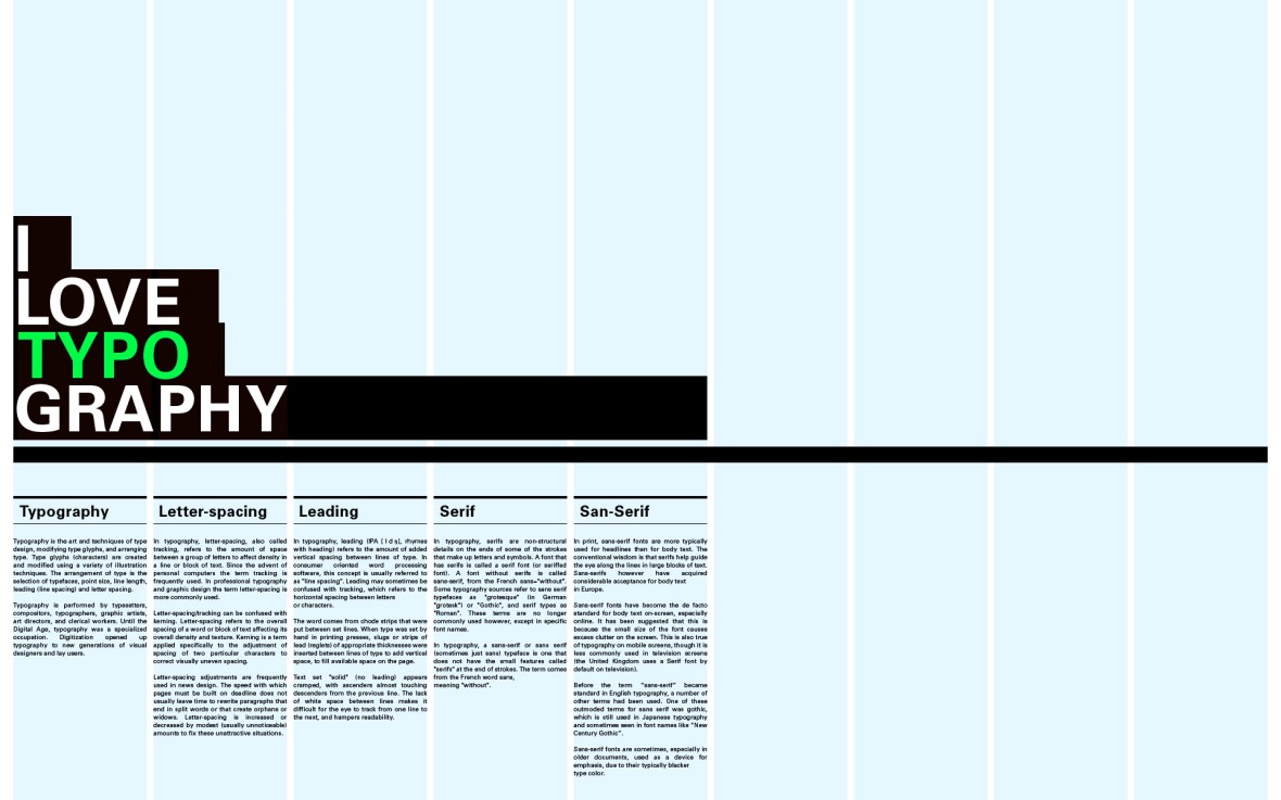
Type
- Choosing and using typefaces
- Has been a very important part of graphic design
- Carefully designed and created
- Carefully select appropriate type
- Avoid free fonts at all costs
- Some typefaces are designed to be easily read
- Bookfaces
- Some typefaces are designed for attracting attention
- Display fonts
- A few typefaces
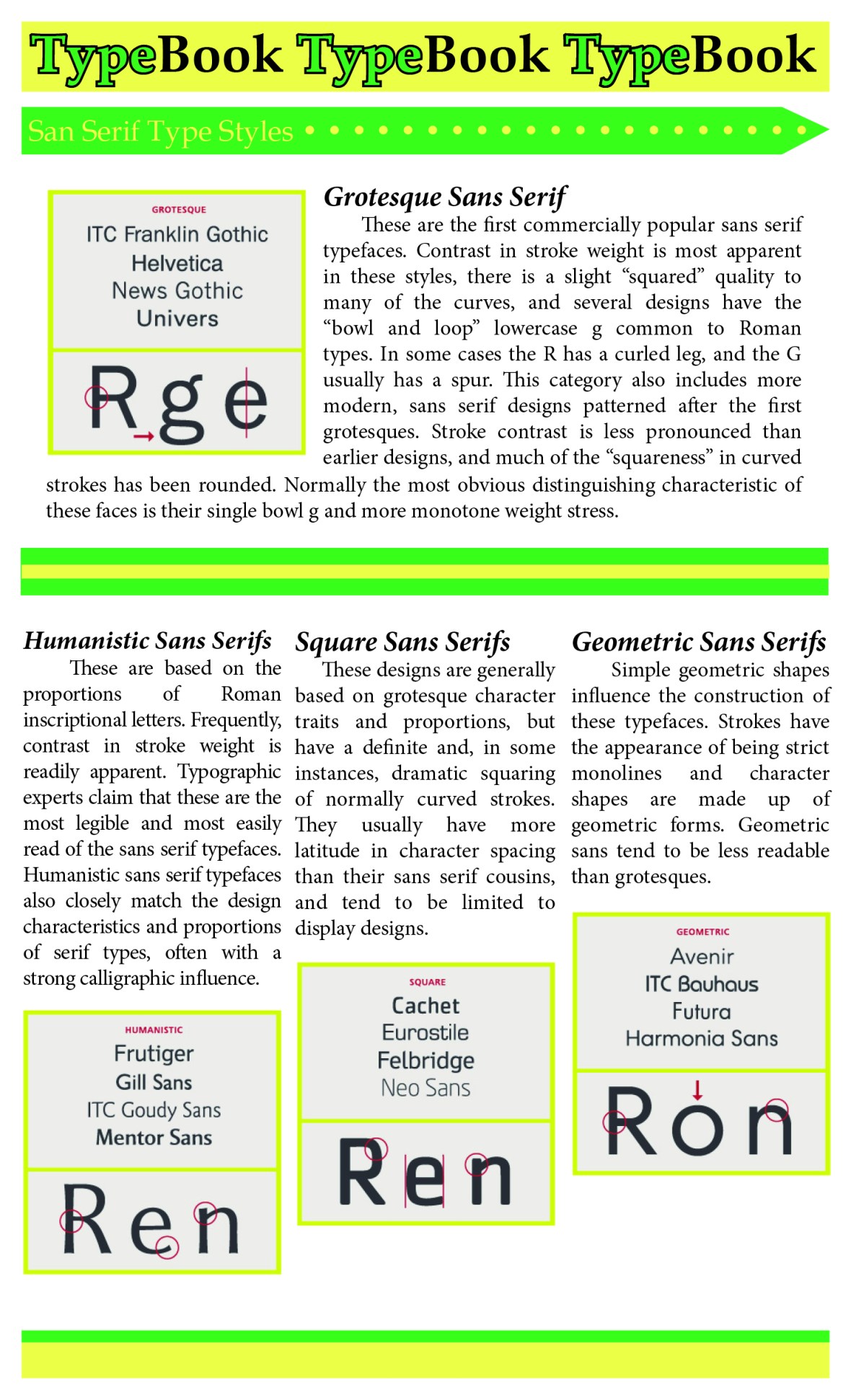
- Sans serif
- Without serifs
- Neo-grotesque
- Late 19th century
- Neue Helvetica
- Univers
- Grotesque
- Arial
- Default typeface designed by monotype
- Think about using it again because everyone hates it
- Screenfont
- Verdana
- Humanist
- Gill Sans
- Geometric
- Futura
- Has been a very important part of graphic design
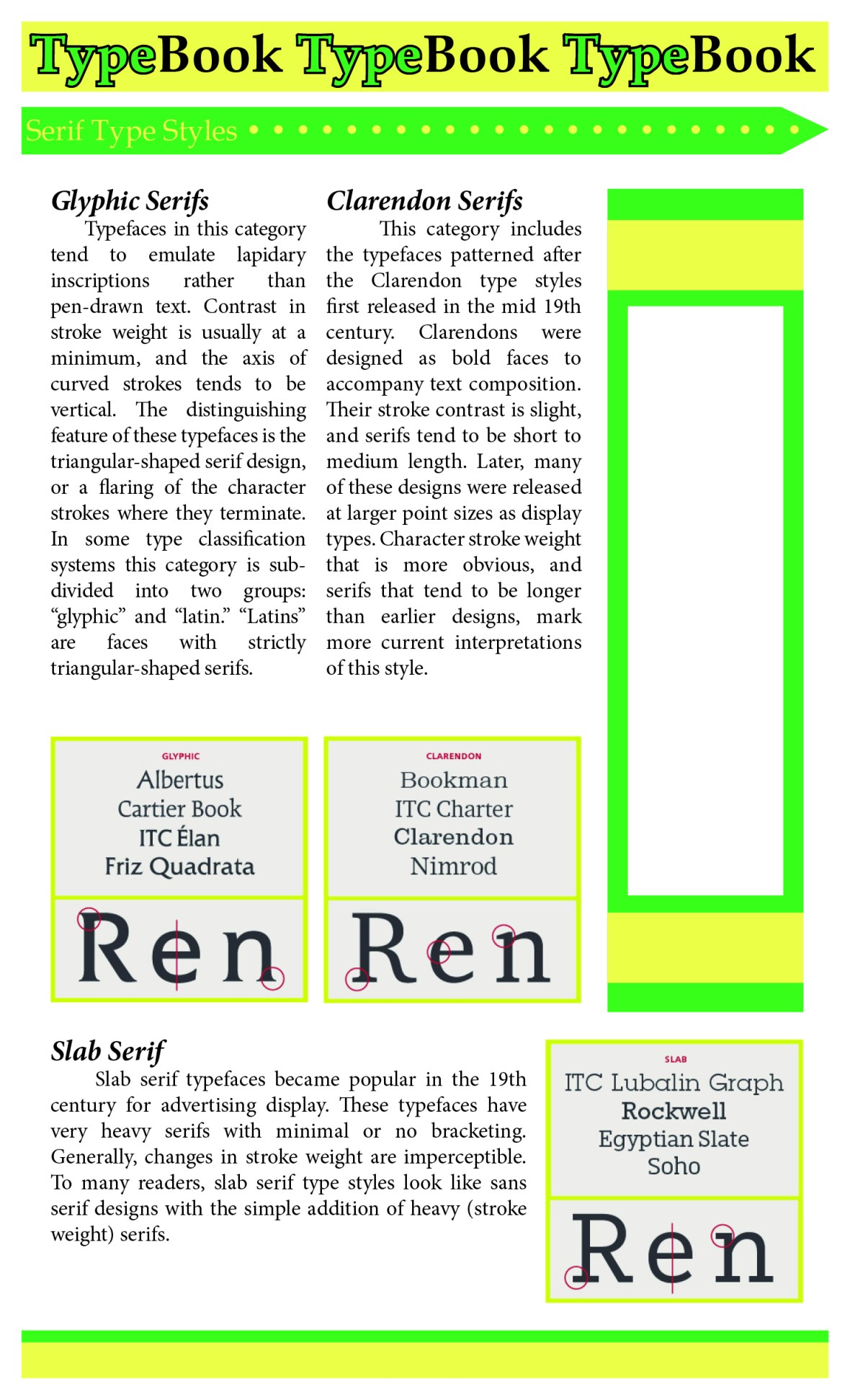
- Serif
- With serifs
- Regarded as more legible
- Old style
- Bembo
- 1509
- Lacks modernity, fits with a cannon of 500 years
- Sits backwards in a slight angle of incline
- Transitional
- Baskerville
- From the enlightenment in 1750s
- Scientific approach to design and communications
- Modern
- Bodoni
- Extreme variations in thick and thin lines
- Sharpness and sophistication
- Neo-classical and Napoleon
- Clarendon
- New Century School
- Used for kids books
- Designed for legibility
- Slab Serifs
- Rockwell
- Single stroke weight

- Other Styles
- Monospaced
- A typeface which has the exact same spacing as the others
- Designed for a typewriter
- Mechanical feel and machine optical reading
- Proportional spacing is when each letter has a different spacing to make it more natural
- Typewriter
- Courier
- OCRA
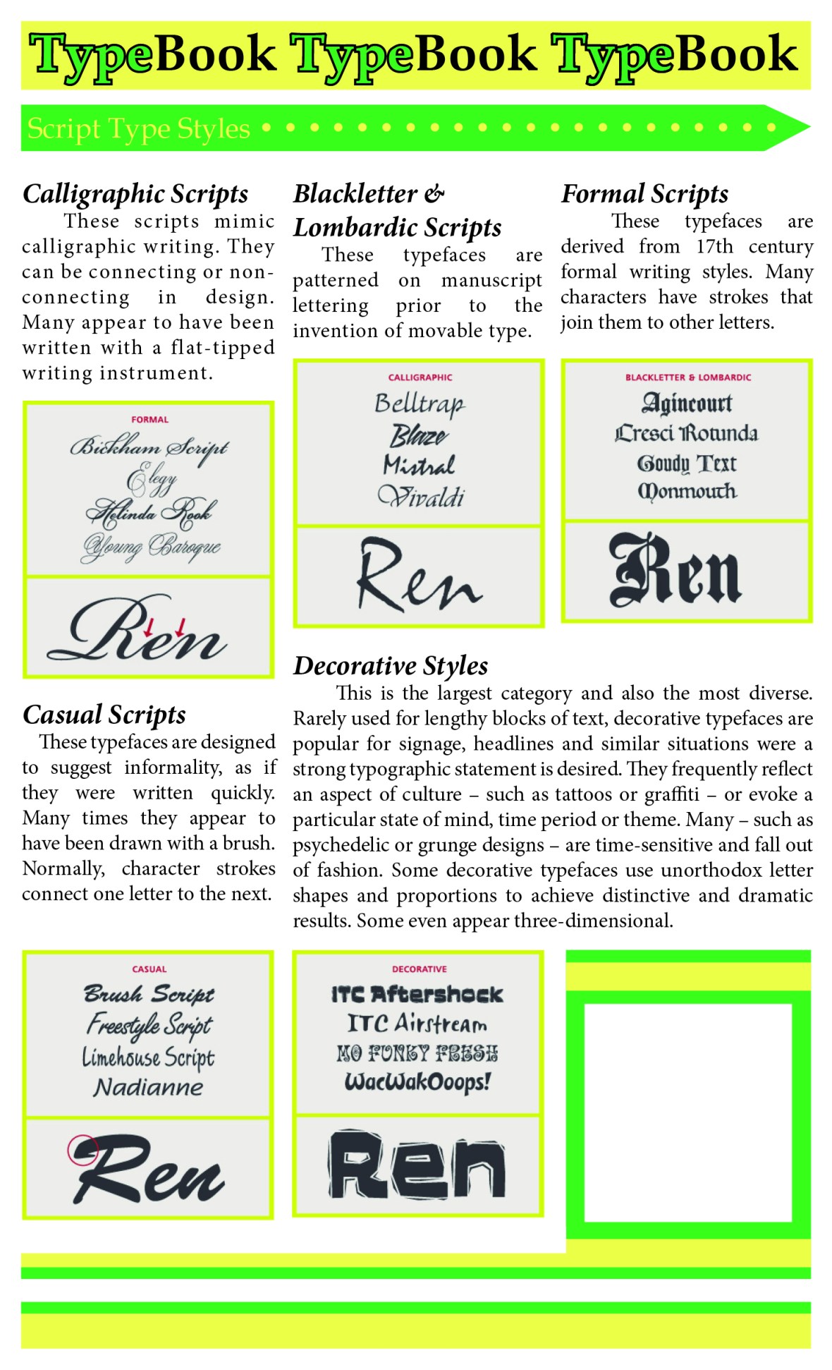
- Script
- Very much for display
- Geometry
- Monospaced
- Combining type
- You can combine different type
- Work within the same family
- Things that look like spiderwebs versus things that look like they’ll poke you
- You can achieve a better contrast with two different typefaces for headings and body
- Headers are usually bolded
Using InDesign
- The character palette
- Changing attributes of words
- Always use metrics, NOT optical
- Optical is a preconditioned InDesign feature
- You override what the type designer intended
- NEVER EVER pull or push the letters!!!
- With smaller type, larger spacing is better
- With larger type, smaller spacing is better
- Changing attributes of words
- Kearning
- 90/90 pt is set solid
- Adjust individual lines for a more solid flow
- DO NOT
- Make fake italics
- Stretch
- Shrink
- ONLY make differences to the form that make differences to the reader
- The paragraph palette
- Manipulate at the level of the paragraph
- Range left is easier to read than centred or ranged right
- Natural order
- Easier on the eye
- The ‘rag’ is the other bendy side of the paragraph
- GET RID OF HYPHENATION!!!
- Don’t justify for the visual summary
- Makes the spaces very irregular
- Condenses and stretches unnecessary letters
- The page layout
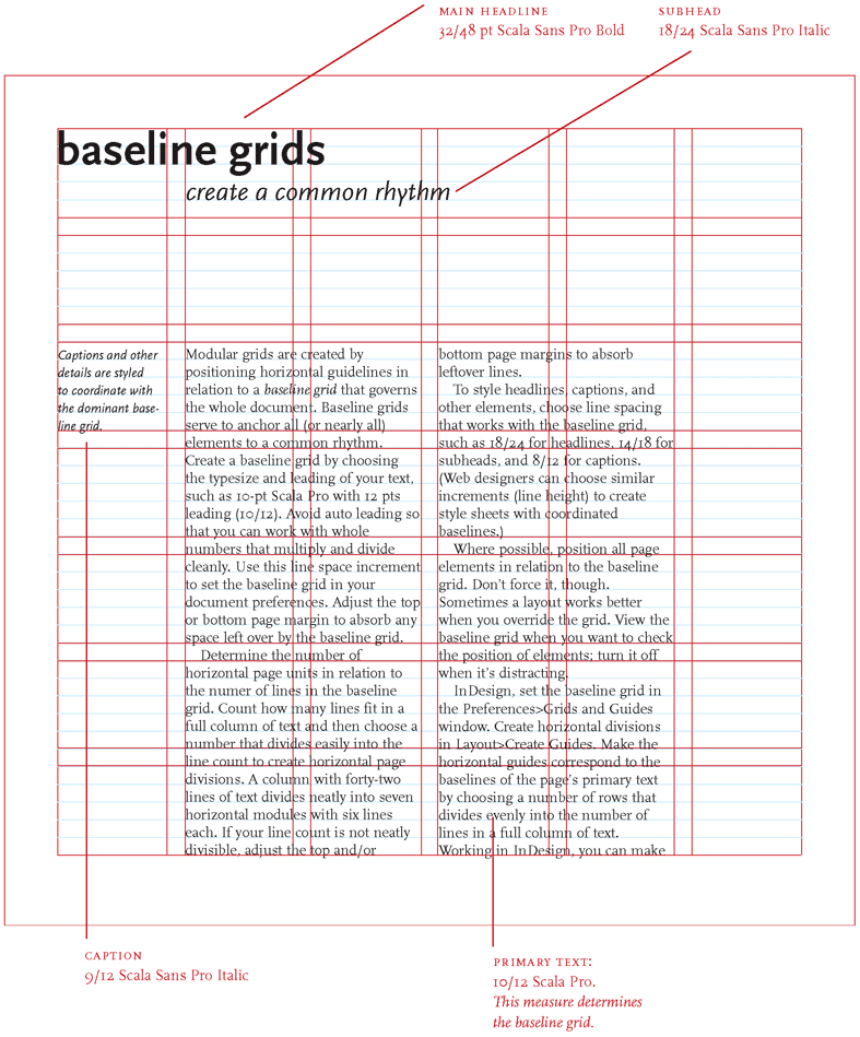
- The grid. Use it.
- Occupy the grid, otherwise everything will be all over the place
- It provides a structure for the document and helps the reader read
- It is a hardwired programme
- Allows for accuracy and consistency
- It helps the design processes by allowing you to focus your decisions on content
- Make double page spreads
- Known as DPS
- Margins
- Columns and gutter spaces
- Baseline grid
- Make type snap to the grid
- “lock to baseline grid” on paragraph palette
- 10 point rows
- Basically, a bunch of boxes
- Make a wireframe for this, it’ll be easier to just drop images in
Books
- Lubalin
- Helmut Schmid
- The Designer and the Grid
- The Grid
Research
Gridwork
Some basic rules for creating a good grid:
- Decide the Type Size and the Kearning – THIS DETERMINES YOUR GRID
- Create a grid based off of this measurement and adjust the margins accordingly
- Make sure your type points are easily divisible and work with one another
- Header, subhead, and body texts
- The grid doesn’t have to be a square, it can be a rectangle
http://thinkingwithtype.com/grid/
https://www.canva.com/learn/grid-design/
Bauhaus Design
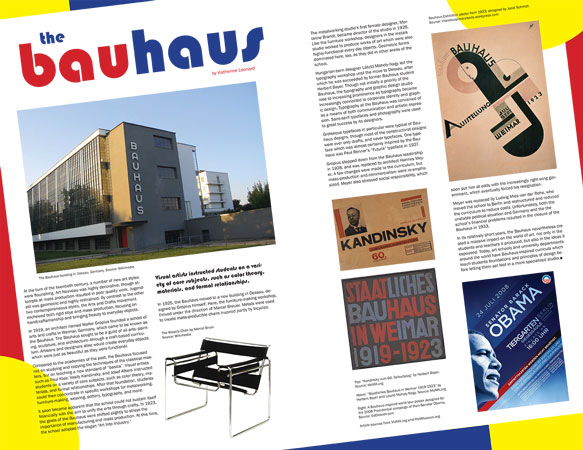
http://katherine.leonard-online.com/graphic/bauhaus.html
Japanese Editorial Design
I wanted to see what editorial design looked like in other languages, especially in languages that do not use the Latin writing system. I love the clean lines in the following Japanese editorial designs, and the way the characters themselves create Gestalt lines of white space I so appreciated in my exercises.


(Top Left) https://www.pinterest.com/pin/28710516349092289/
(Top Right) https://www.designspiration.net/save/58718070611/
(Top Centre) http://creativeroots.org/2011/05/a-tast-of-japans-kikkoman/
(Bottom Left) http://tangdanning.com/oldhoney.html
(Bottom Right) http://wangzhihongcom.tumblr.com/search/book
In-Class Work
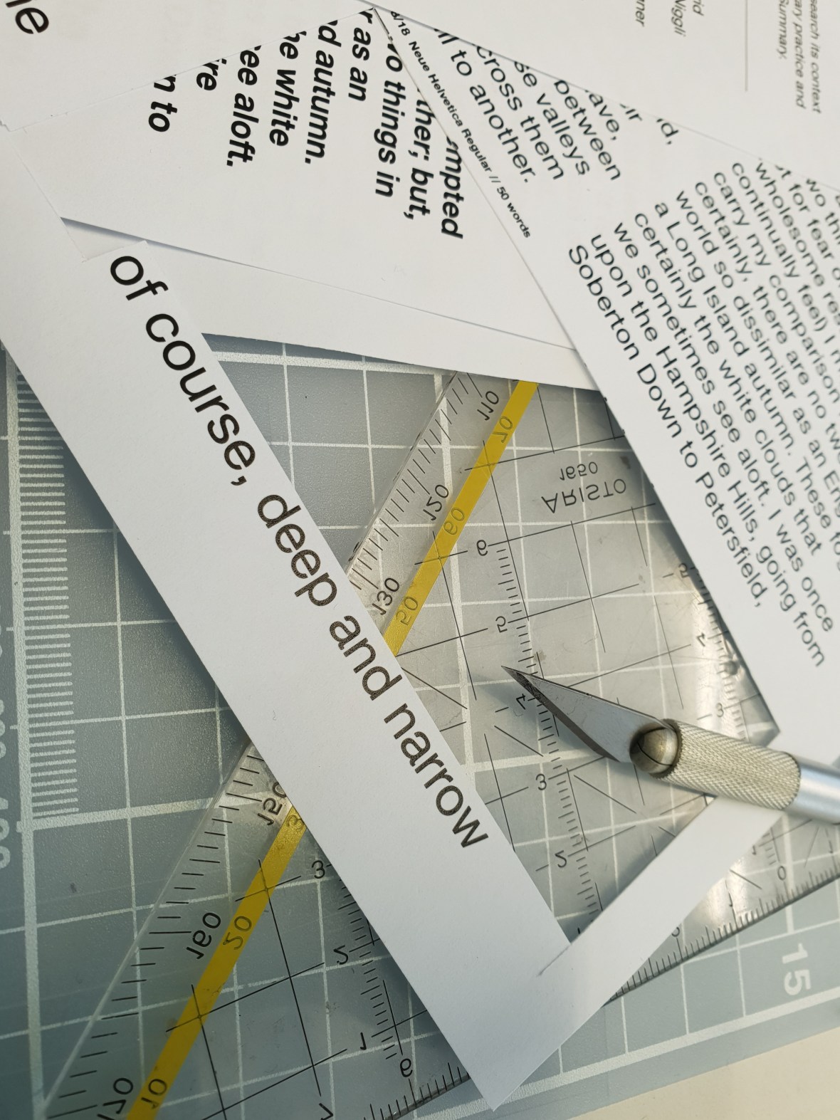


The pre-steps of the layout exercise


The first experiments.
Small adjustment


In-class layouts from my classmates.
Finishing and Development
The First Exercise: Rules
- One headline of 10 words
- One introduction of 40 words
- Two pull-quotes of 20 words
- One sidebar of 85 words
- One text block of 700 words
- Four images
- Four captions of 20-30 words

Likes
- The clean lines created by the compact text structures and the images: there is almost a rectangular path running down the page
- The separation of the sidebar
- The balance of shadows and light in the selected images
Dislikes
- The pull quote at the end may need to be more towards the beginning
- The awkward white space left at the top: it increases emphasis, which I like, but it looks a bit out of place. Maybe try left justifying the text?
The Second Layout: Rules
- One headline of 10 words
- One introduction of 40 words
- Two sidebars of 175 words
- One text block of 300 words
- Six images
- Six captions of 20-30 words
Likes
- The rhythm created by the images and sidebars on the page
- the way each type of type is separate and distinguishable
Dislikes
- The awkward interaction of white space on the top left-hand corner
- The apparent “floaty” quality of the text
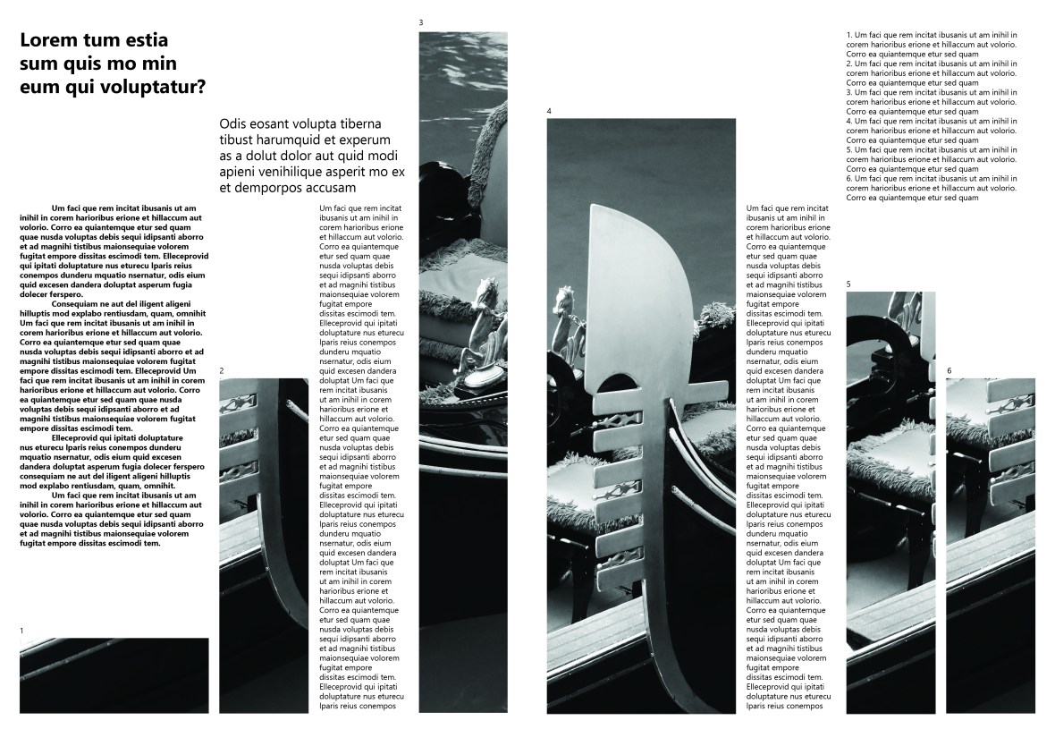
Third Layout: Rules
- One text block with 450 words
- Two images
- Two captions of 20-30 words
- One running head of 6-10 words

Likes
- The block of the two images divided by the text
- The white bar at the bottom which clearly, but subtly, highlights the captions
- The running head looking part of the spread, but also visibly different from the copy text below
- The bleed of the image onto the edges of the document
- The asymmetrical balance of the piece
- The simplicity of the grid
Dislikes
- The ragged edges of the paragraphs somewhat disrupt the smooth lines of the overall layout and other lines, all of which are smooth
The Fourth Exercise: Rules
- Three pull quotes of 40 words
- A text block of 700 words
- Three images
- Three captions of 20-30 words
- One running head of 6-10 words

Likes:
- The asymmetry of the design
- The minimalist way of captioning images
- Gestalt square in the middle
- The way the running head works together with the columns and images on the right hand side
- The lines and pathways created by the negative space in the design
Dislikes:
- The column in the right seems slightly out of place
- There is a slight reading disconnect between the second column and the third column
Final Work
My final work for this piece will be based on the following image, which I saw on the way home from LCC.
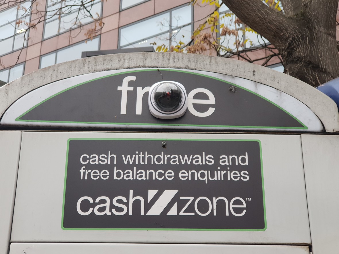
In this project, I want to focus on either this idea of surveillance and juxtaposition or the incredible juxtaposition of Harrod’s in Kensington. I went to the massive shopping centre recently with a friend, and I have never felt more alienated in my life, personally because of my aversion to spending too much money, and also because there was such an incredible distance and gap between people who ‘belonged’ there and people who did not — and a corresponding prejudice.
